Portfolio
This page lists various visualization projects that Jerome has done prior to 2018.
Smart Mapping
An intelligent system that recommends how you can visualize your geospatial data
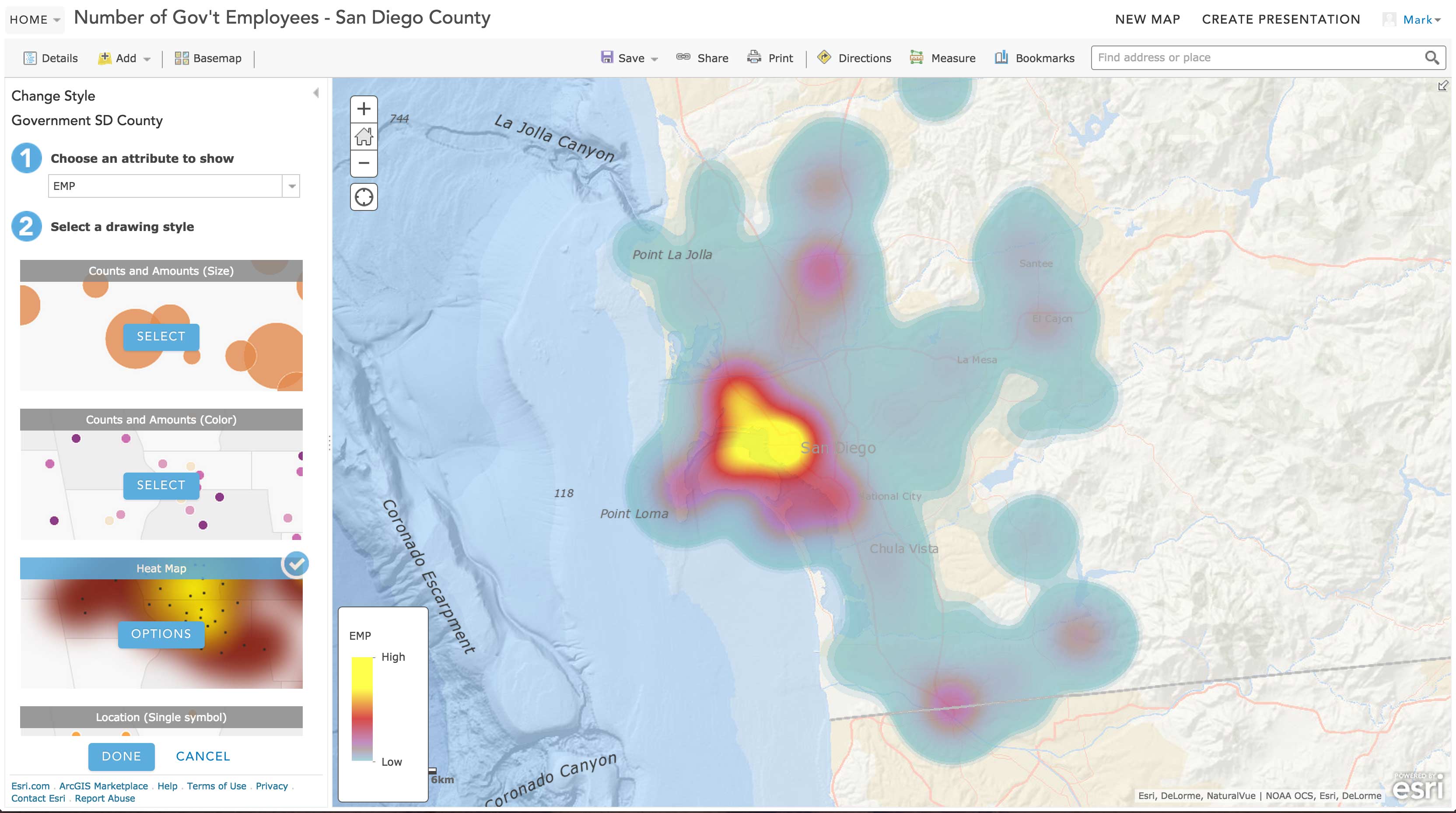
“We want to go one step further for you” is the motivation of this project. Instead of letting you set visualization method, color, symbol, etc step by step, ArcGIS.com is now going one step further for you. We analyze your data and recommend good ways to visualize them for you. By no means this means you lose your control over your visualization, but our smart default will make your visualization production process quicker and more enjoyable.
I was the primary prototype developer on this project, involving extensively in research and product version development. This technology has been published as a US patent.
- Smart Mapping Home (overview & video)
- Introducing Smart Mapping (blog post)
- Systems and methods for smart cartography (US Patent US20160246468A1)
Knowing your Customers with Pointillist
An revolutionary customer journey analytics platform

Nowaways, millions of web user events (such as clicking a button, checking out a URL, etc) happen and are recorded every day. Pointillist pulls all these events together to show the big picture behind the scene.
This platform was built as a big data analytics solution for non-technical users, and therefore there is significant amount of work on its front-end, as well as the web services to support the it. As a founding and primary developer, I have been in charge of the UI/UX, visualization, and REST services since the beginning of the product.
Evolving Geo-Visualization at Esri, 2013-2014
Data Visualization with ArcGIS API for JavaScript
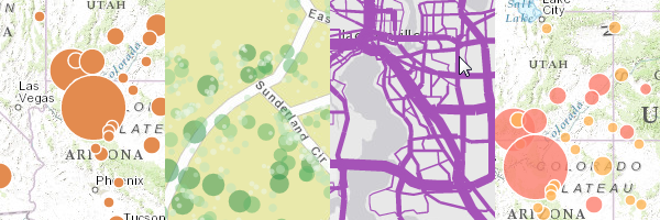
“Let geographic data tell stories via the Internet” is this project’s goal. As world-wide web becomes the primary media of maps and geographic information, how should traditional maps and cartography evolve to meet the emerging needs and challenges of web mapping?
Throughout the years of 2013 and 2014, we significantly expanded our web mapping platform with more intuitive, comprehensive and east-to-use API for developers. Now a pretty dot density map or a choropleth with opacity variation can take only a few lines of code. While many customers have taken these new tools to create their own cool pieces, we also built a bunch of pretty demos to prototype, to inspire and to explore the future of geospatial data visualization.
My blog posts
- Data visualization with ArcGIS API for JavaScript
- Show Data by Unique Value
- Enhancement Options
- Show Data by Color
- Show Data by Size
My conference videos
- What’s New for ArcGIS API for JavaScript (2014)
- ArcGIS API for JavaScript, Mapping and Visualization
Demos
- One dataset, multiple ways to visualize
- Scale-dependent dot density map (A web-based dot-density map I developed. Try zoom in/out to see how the dot value changes with scale.)
- Choropleth map without class breaks (No class break anymore - we just map it from the minimum to the maximum!)
Angular-based Visualization: Urban Population of the World 2015
An attempt to manipulate SVG with Angular.js, and to show both quantity and percentage simultaneously
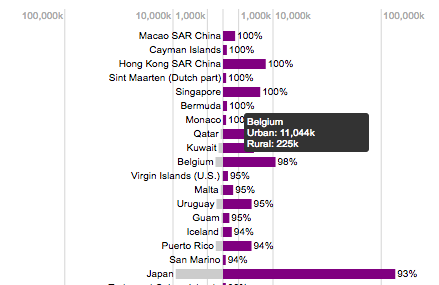
I tried to achieve two goals in this visualization.
Graphically, a quantity and a percentage are displayed with one single graphic for each country. The bar length shows population, whereas 10 different colors are used to show various percentages. The countries are ordered from the most urbanized to the least, so the order in the sequence can help the audience grasp how urbanized a country is compared to others.
Technologically, this visualization was created with only Angular.js. No d3.js is used. The advantage of this approach is a more contemporary, declarative, succinct way to manipulate SVG elements (compared to d3.js or jQuery). Also Angular’s native directives, such as ng-mouseenter, ng-if, provide easy access to trigger events or toggle elements.
You can check out the application here.
AfricaMap
Web-based geospatial data visualization in collaboration with the Center for Geographic Analysis, Harvard University
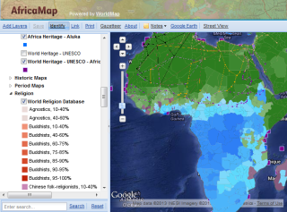
AfricaMap is an open-source web mapping platform designated for archiving, visualizing and integrating geospatial statistics particularly for Africa. One can easily find statistics from various organizations and governments, but how do we fit them together in one single platform?
As a GIS analyst at Center for Geographic Analysis (CGA), Harvard University, I worked with African-Art-and-Architecture historian Dr. Suzanne P. Blier to retrieve statistics from various sources, and explored the options to make these number “visible” on map. To handle data in various formats and qualities, I employed my fimilarity with data syntax and skills in programming for text processing to handle the data effectively and accurately. This is an ongoing project and all results are available at http://worldmap.harvard.edu/africamap.
Map as a Communication Tool
Various thematic maps as storytelling media
A map with good graphic design can convey messages in an informative and vivid way. As both a cartographer and a graphic designer, making maps with proper design is what I am striving for. This section contains maps I made for various projects.
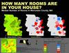
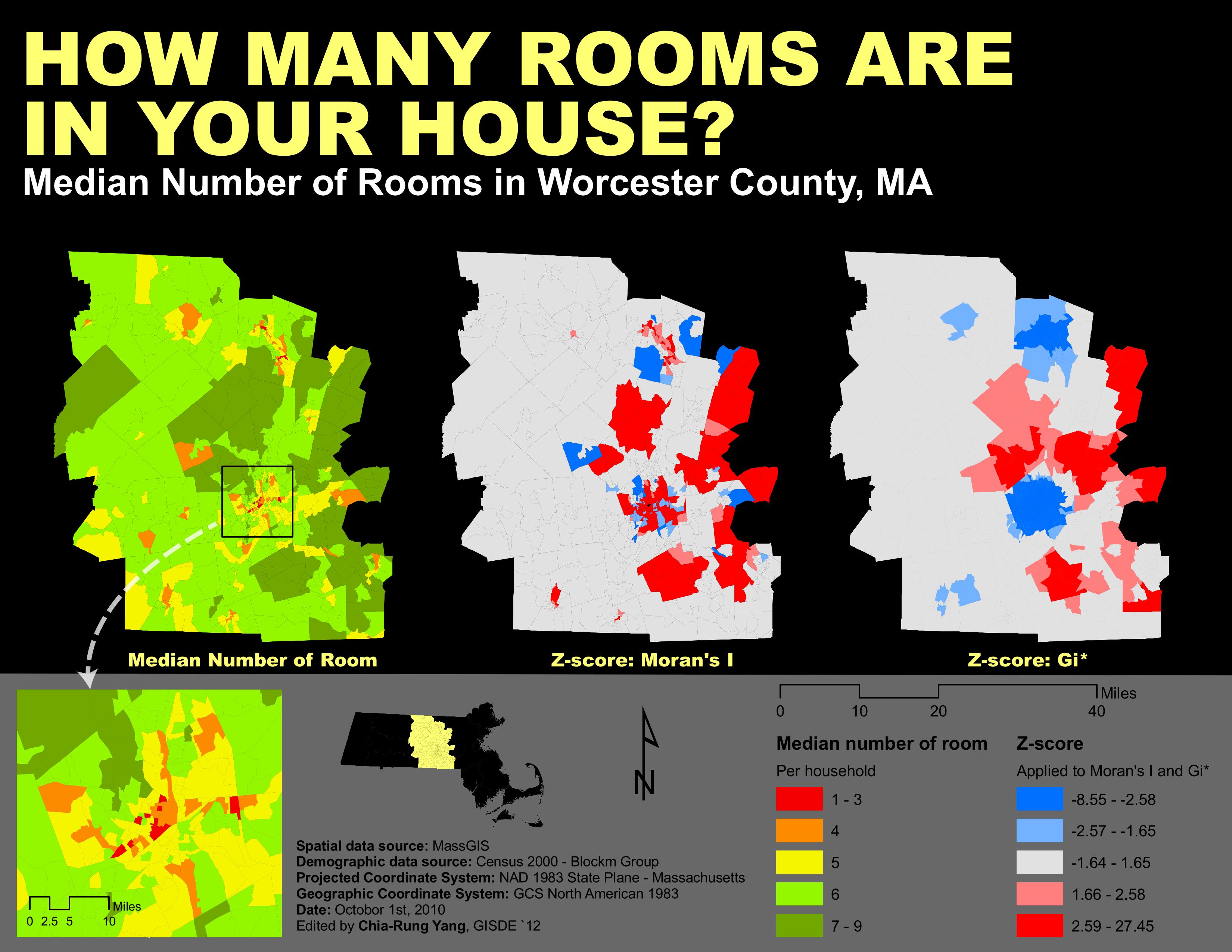
How many rooms are in your house?
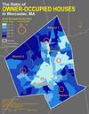
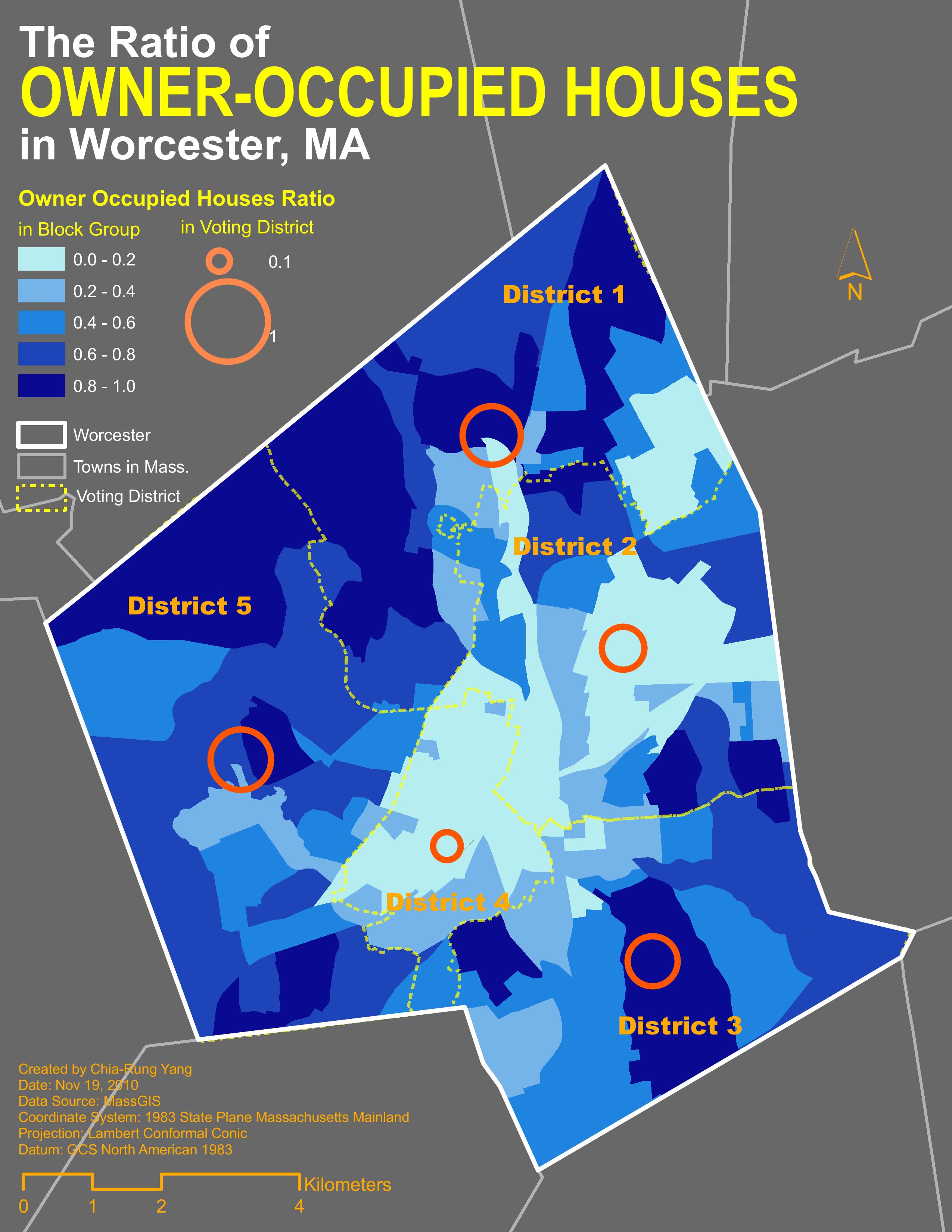
The ratio of owner-occupied houses
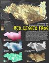
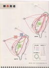
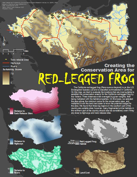
Creating conservation areas for red-legged frogs
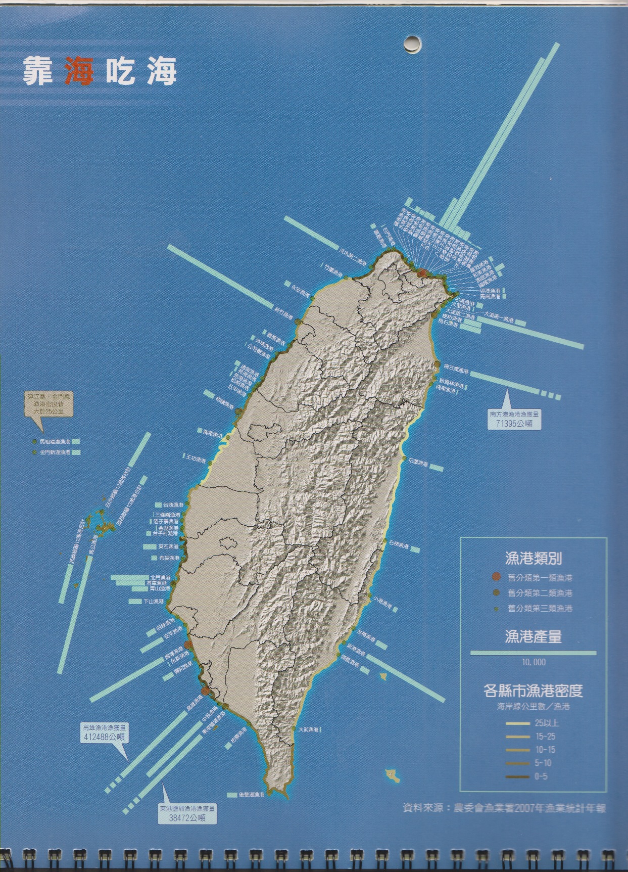
Fishing ports and annual production
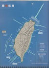
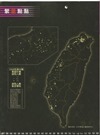
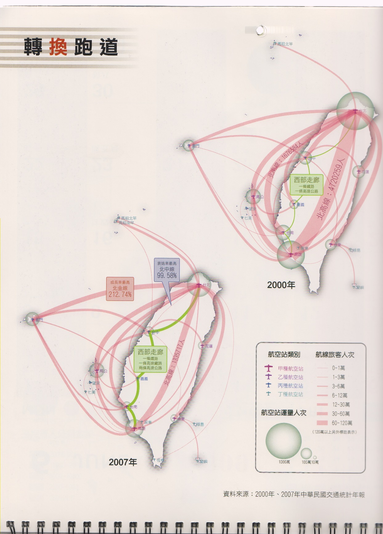
Shrinking air routes
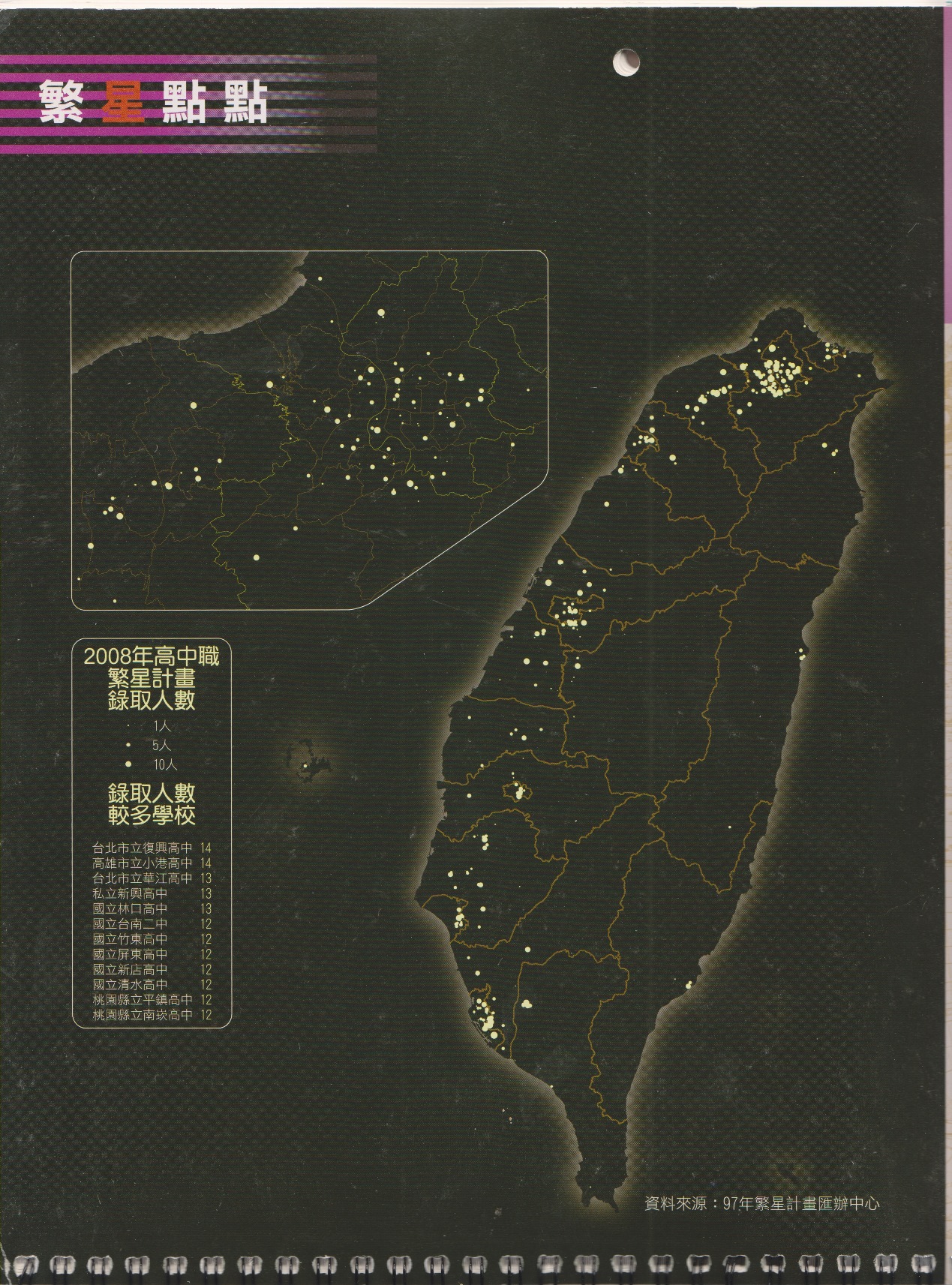
Special college admission program
Visualization from Scratch: Air Pollutants Mapping
Beginning with collecting first-hand air quality data in the field
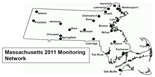
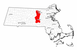
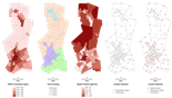
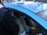
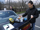
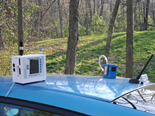
Air pollution mapping requires interpolation from point data. Instead of obtaining observations from existing monitoring stations, in this project we mapped air pollution from scratch - that is, we designed a monitoring network where the distribution of stations is optimized, went into the field to collect first-hand data, and explored the best way to visualize the data. Works included spatial optimization algorithm, experiment design, field particulate matter measurement, and visualization.
This project, which was proposed and coordinated by me, ultimately involved a interdisciplinary and collaborative effort of two professors and four graduate students with background in GIS, environmental science, physics, etc. It was awarded by Geller’s Research Grant at Clark University.
GIS off the Shore: Eelgrass Mapping
Getting GIS on board with the Maine Department of Marine Resources
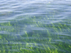
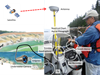
Eelgrass (Zostera) is an vital species in coastal ecosystems. It provides nutritions for many shallow ocean animals, and consequently sustains the fishery economy in the state of Maine. The goal of eelgrass mapping is to investigate, monitor and visualize eelgrass distribution.
Before entering the field, potential eelgrass patches were identified on low-tide aerial imagery and digitized in ArcGIS. While in the field, we drove a boat, navigated by ArcPad to visit every location we identified, and recorded the actual condition with notes, GPS tracklogs, photos and videos. After the field work, the data collected were summarized and released as public-accessible information in a web mapping application.
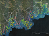
Web GIS Crowd-sourcing
Developing interactive, collaborative web mapping applications
Internet provides an effective way for multiple people to contribute geospatial data to one database. I participated in two crowd-sourcing GIS projects.
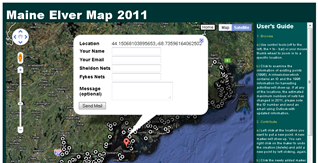
Maine Elver Map was designed for marine patrol officers to report locations where illegal harvesting of elvers (young eels) were found. It successfully gathered 85 locations reported by about 10 officers. It employed Google Maps API and Google Fusion Table to provide a user interface and a publicly accessible database. Any input data was immediately reviewed by administrators via email to ensure the quality of the data.
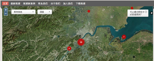
QianTang River Map was built to gather succeptible water pollution activities along the river. This project was initiated by Green Zhejiang, an environmental protection NGO in China. I worked as the primary technical lead to implement the system. Built upon Ushahidi’s CrowdMap platform, it leverages open-source tools to provide a zero-cost and easy-to-use solution to the NGO’s need for crowd-sourcing.
When Something is Built
3D terrian visualization of prospective constructions


In the beginning of the 21st century, Taiwan government proposed several “mega projects”, including a highway crossing a 10,000-ft mountain ridge, a 4000-acre artificial reservoir for industrial water supply, etc.
To simulate these projects’ impact on the landscapes, I independently created 12 3-D visualization scenes to give the public a chance to “preview” the changed landscapes when the construction is complete. These scenes were made by scanning and georeferencing maps from the project plans, retrieving Google’s sattelite imagery, overlaying data with digital terrain model (DTM) in ArcScene, and post-export editing with Corel PhotoImpact.